In the United States, health insurance is more than a financial buffer—it’s a lifeline that determines whether people can access care or fall through the cracks. For adults aged 35 to 64, the stakes are especially high. They’re too old to qualify for most children’s or young adult programs and too young to benefit from the universal coverage provided by Medicare. As a result, many fall into a gap—aging into chronic health issues without a safety net.
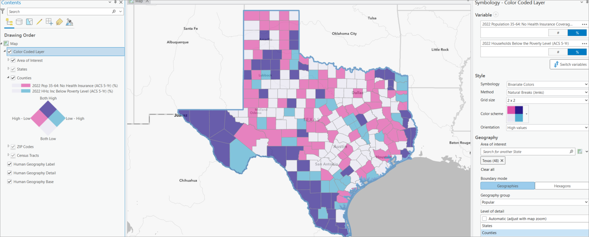
Texas stands out in this landscape. Despite being home to some of the largest cities and hospitals in the country, it has the highest uninsured rate in the U.S., and the problem is particularly acute among working-age adults. According to 2022 American Community Survey data, Texas’s uninsured rate for adults aged 35–64 is 8%—more than double the national average of 3.7%, as shown in the map below.

Imagine this scenario: the Texas State Office of Rural Health is preparing to deploy outreach teams to provide screenings, preventive care, and essential health services in areas with limited health-care access. With constrained staffing and funding, they must decide where these efforts will reach the most people in need. They’re not just looking for rural communities, they’re looking for the ones where the burden is heaviest.
To support this kind of targeted decision-making, we used ArcGIS Business Analyst Pro to create a bivariate map using the color-coded layer workflow. This map highlights where poverty and lack of health insurance intersect among adults aged 35–64 in Texas, revealing where outreach could have the greatest impact.
In this blog post, we’ll guide you through a step-by-step workflow, demonstrating how to use a color-coded layer in ArcGIS Business Analyst Pro to identify high-need areas so you can prioritize outreach efforts where they’re needed most.
Step 1: Create a bivariate map
Start by using the color-coded layer workflow in ArcGIS Business Analyst Pro to visualize two key variables: poverty rate and percentage of adults aged 35–64 without health insurance.
To begin:
- Go to the Analysis tab in ArcGIS Business Analyst Pro.
- Click on Business Analysis and select Color-Coded Layer from the gallery.
The Data Browser window will appear.
- In the data browser search bar, type “Health Insurance” and press Enter.
- From the list of results, check the box for: 2022 Population 35–64: No Health Insurance Coverage. Be sure to select the percent (%) metric for comparability across counties.
You’ll see a single-variable map showing uninsured rates across the U.S., with Texas clearly standing out in a darker shade—indicating a higher percentage of uninsured adults.

Zooming in: Texas county-level patterns
On the Symbology pane, go to the Geography section and set the area of interest to Texas. The map will automatically zoom in. Then, under Level of detail, select “Counties” to display the data at the county level.

Add a second variable (poverty rate)
Return to the Symbology pane and add a second variable

- Search for “Poverty” in the data browser.
- Select “2022 Households Below the Poverty Level” (percent).
Adding this second variable creates a bivariate map where color blends represent the overlap of both indicators. Set the grid size to 2×2 and the orientation to highlight high values. Dark purple indicates counties with both high poverty and high uninsured rates.

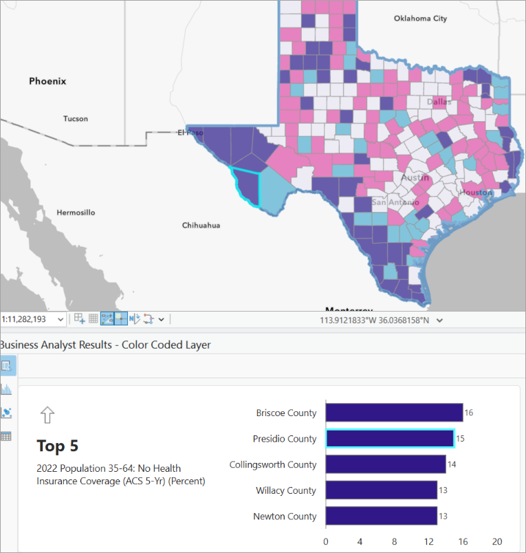
Click View Results to open the Results pane and identify counties with the highest combined burden.

In the Results pane, you’ll see a ranked list showing the top 5 counties for each selected variable. Presidio County stands out in this analysis—it ranks among the top five for the percentage of uninsured adults aged 35–64, at 15%, nearly twice the Texas average of 8% and four times the national average of 3.7%.
Presidio also has a poverty rate of 31%, further compounding the challenge. Its rural, border location presents additional barriers to health-care access, making it a strong candidate for targeted outreach.
To better understand the distribution of need within Presidio County, we move to a finer scale of analysis.
Step 2: Zoom into a target county and apply hexagon binning
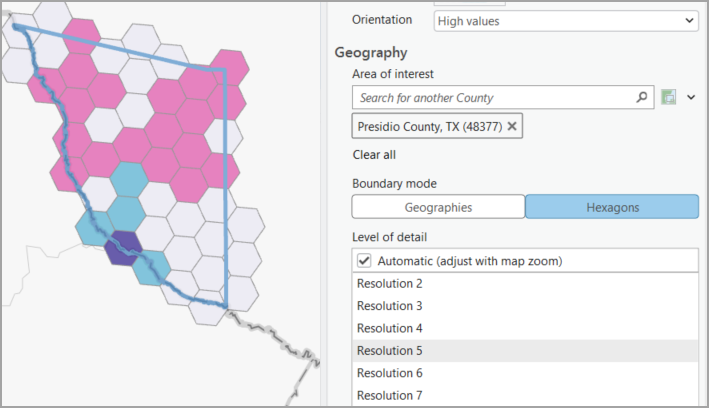
Set Presidio County as the area of interest. While you can use census tracts or block groups, these administrative boundaries are often large and uneven in rural areas, which may obscure important local variation.

To gain more detailed insight, switch the Boundary mode setting from Geographies to Hexagons. Hexagons create a uniform grid across the map, with evenly sized units that enable consistent spatial comparisons. Unlike census block groups, they are not tied to administrative boundaries, making them ideal for detecting patterns that might be hidden within larger, irregular areas. This level of granularity is essential for identifying specific zones where outreach efforts such as mobile clinics, health navigator visits, or resource distribution can be most effective.

One hexbin in southern Presidio County emerges in dark purple— indicating high values for both variables. The Results pane reveals concerning statistics for this hexbin:
- Uninsured rate: 17% — more than double the Texas average (8%) and over four times the national average (3.7%).
- Poverty rate: 56% — compared to approximately 13% statewide and 11% nationally.

Now that we’ve identified a high-need hexbin, we move to Step 3, where we take a closer look at the key demographics of the population living in that area.
Step 3: Explore key demographics using Health Care & Insurance infographic
Once you’ve identified a high-need hexbin, it’s important to understand more about the population behind the data.
Click on the selected hexbin, then click the Infographics button from the Map toolbar and select “Health Care & Insurance.” This built-in template in ArcGIS Business Analyst Pro provides a detailed snapshot of health and demographic indicators—including insurance coverage by age group, uninsured rates, Medicare enrollment, annual health expenditures, and basic lifestyle information like physical activity and population size.
Watch the animation below to see the infographic in action.

Key findings from the selected hexbin
The Health Care & Insurance infographic for the hexbin in southern Presidio County offers a deeper look into the population living at the intersection of poverty and lack of insurance:
- 16.9% of adults aged 35–64 are uninsured, well above the state and national averages.
- Annual health-care spending is very low, at just $1,332 per person for insurance and $656 for medical care.
- Only 0.5% of working-age adults have employer-based insurance, suggesting limited access to employer benefits.
- A large share of older residents rely on Medicare & Medicaid, rather than private or employer-based options.
- Physical activity is limited, with only 8.3% reporting regular exercise at a gym or club.
- The total population is just 3,341, but the health and economic challenges are highly concentrated.
These findings reinforce what the map suggests: this is an area where multiple barriers to care converge, and where localized intervention could be especially impactful.
Conclusion: From data to action
Through this workflow, we used ArcGIS Business Analyst Pro to uncover where poverty and lack of health insurance overlap among adults aged 35–64. By combining bivariate mapping, hexbin analysis, and local demographic insights, we moved beyond identifying need—we revealed where support is most urgently required and who is most affected.
This approach empowers state and local agencies to direct resources with precision, focusing efforts in places like southern Presidio County, where targeted outreach can make the greatest difference.


Article Discussion: